Recently the old uncle’s signboard design caused a lot of friends in the design circle to discuss.Domatters also paid attention to the pros and cons of many opinions, but Domatters see mostly did not say the point, so write this article, do a description, by the way, the popularization of brand marketing design knowledge.We hope to inspire and help your brand design, so that enterprises less detours!
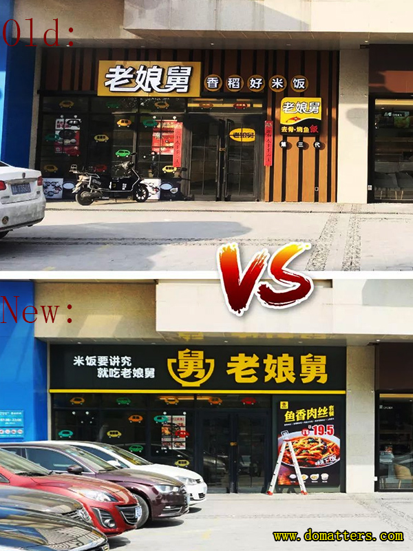
First of all, let’s take a look at the old uncle new old signs:

Why do you do this?What aspects should brand marketing design consider?
Next, Domatters will provide technical explanation and design psychological consultation for the design of old uncle’s signboard from the following three aspects:
1.Shelf thinking — don’t look at designs on a computer, look at them on the street
2. Treatment plan and psychological counseling for “LOW soil disease”
3. The culture of contemptuous businessmen and the mentality of being ashamed to serve businessmen
Shelves of thinking
Don’t look at the design on the computer
To go out on the street and see all the design has to start from the end, from the business environment to do the design.All commercial design is not on a computer screen, not in the spotlight, not in an art gallery, but in the business environment.
The most important environment of business environment is the environment of commodity display, namely the shelf.Shelf thinking is to design from the shelf where the goods are displayed and the information environment in which the goods are located.Shelf thinking is to regard everything as the sales shelves, not only the shelves in the supermarket, the web is also the shelves, and for a store, the street is the shelves, the head of the store is the packaging.
A good design will gain display advantage on the shelf
The shelves of FMCG are in the supermarket.The shelf of the APP is the screen of the phone.For a restaurant, the street, the mall is its shelves, his shop, signs are packaging.
Shelf thinking, is to go to the shelf, based on the competitive environment of commodity information, design from the three principles.The concept of “three manifestations” is the idea of Toyota’s production mode, that is, the scene, the object and the reality. To solve the problem, we should go to the scene, point and check the object and observe the reality.
The scene is the space.Look at the object. The object is something in front of it, in front of it, in front of it, in front of it, in front of it, in front of it, in front of it.Reality is a timeline of what happens from morning till night.
The scene, reality and reality are three eyes.
(1) the scene needs the eyes of the eagle to see the overall situation, the panorama of competition and the overall information environment, rather than the parts;
(2) the object needs the eyes of a rabbit. It is necessary to crawl on the ground and see 360-degree details.
(3) reality requires the eyes of trees, to be still, to see what happens from morning to night, to see the whole process.
The third is the most difficult.For example, record the journey of all customers.If ten thousand people pass by the store, make a note of each of them.This method is behavioristic, which can also be said to be derived from Taylor’s scientific management. It improves the process design through motion observation, motion measurement and motion timing.
All the ideas are there.
Signboard design, in fact, is the design of the street people into the shop to buy the whole process, the use of “flow conversion principle” in all processes to improve the conversion rate.
Through the effort of the three principles, we can find the true cause of success or failure, summarize the principles of the operation of things, formulate the principles to solve problems, and then, always act in accordance with the principles.Therefore, it is also called “three shows and two originals” : site, object, reality, principle and principle.
Signboards are designed to gain display advantage on the street
Packaging design, in order to obtain display advantages on shelves, improve sales efficiency.The store head design, is to let the storefront in the street shelves to obtain display advantage, improve sales efficiency.
In the scene of the street, we observed the scene, namely the environment of urban buildings and forests, surrounding shops and people coming and going.
But the reality, is this coming and going of people, how many people notice this street you have this store!We all have the experience of walking on the street. Can you notice some shops in this street?
Signboard design around the flow of the conversion link to think
The customer’s journey is to see the store – stop – come in – buy – experience – leave – spread to others.Our design should focus on the flow conversion link:
(1)How many people saw those who passed by
(2) how many of the people you saw stopped walking
(3) how many people stopped walking into the store
(4) how many people come into the store to buy and how many to buy
(5) what are the experiences worth recalling and talking about for people who consume after purchase
(6) how many people recommend it to others and what do they say when they recommend it
Like “passing by.”What is passing by?Is in the shop door past count pass by?Or is walking across the street just passing by?Or is the vertical street intersection far away from the oblique through also counted as passing?Does speeding past count as passing by?
These a few kinds of circumstance calculate to pass by, drive fast and also calculate, he saw in the car today, tomorrow he may come to consume.
In short, you can “pass through” the scope of the expansion of how much, your traffic is big.We pay the rent and buy the flow of the street.However, due to the difference in design thinking, the conversion rate from “bought traffic” to “see” is quite different!This also can bring about the result of management to also have very big difference.
How to increase the chance of being seen? So how do you expand the conversion rate from “pass through” to “see”?We’ve summarized five principles:
(1) the signboard shall be eye-catching;
(2) the signboard should be large;
(3) more signboards;
(4) the sign should be bright;Store lights also want to be bright, do not want to be reluctant to electricity, the best sign can also shine move up;
(5) the font on the signboard should be large.
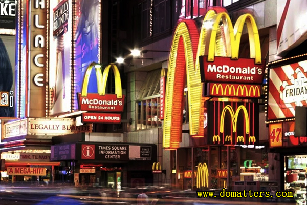
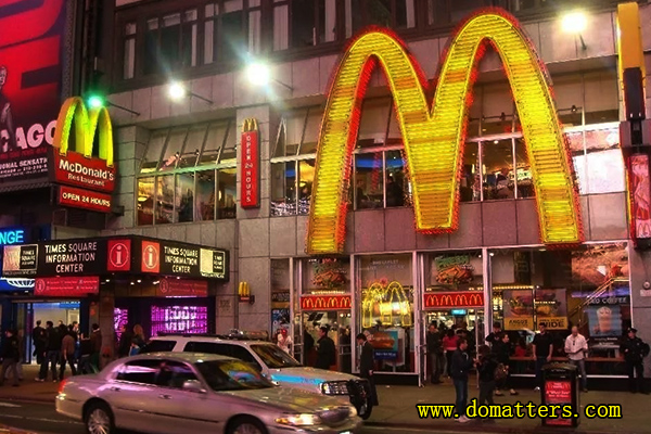
This truth can be said to be the most simple.Business has done this for centuries.The more successful the enterprise, the more it knows how to use it to the extreme, such as this picture, you look at the McDonald’s in New York times square, this is the dream store design.

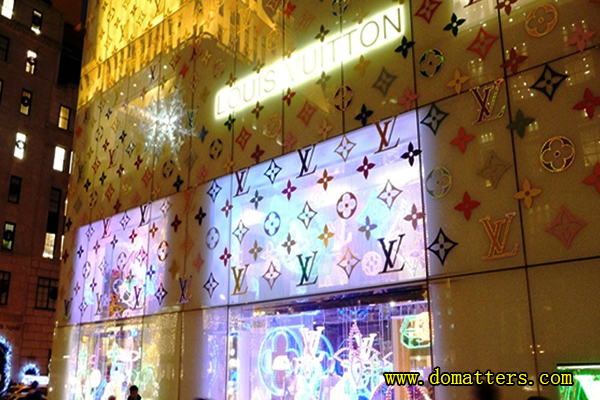
There is LV whole building is wrapped up, that is even better!

As for the font on the sign to be large, and the sign to be large is a reason, but also simple.The ultimate in this is the extraordinary duck neck.His typeface stretched to the width of a signboard, leaving nothing to chance.

Even other super great graphic signs, he is determined not to use, the reason is that his store is small, signs are not long enough, put the graphics, “absolutely taste duck neck” four words will be reduced.
Therefore, the standard font size on the sign, is to try to fill all the space of the sign, do not leave white.
“No white space, isn’t it too ugly?”This kind of saying, do not have “3 show creed” concept namely, you see a design only on the computer, and be not to see a design in street environment, whole building, whole street, be your leave white?
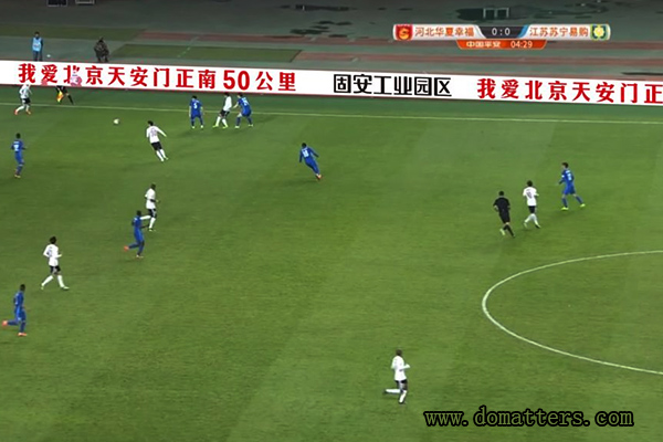
To understand this, the simplest example is to look at the billboard beside the football field.Because the whole field is your white space!Those who do not understand this, inexperienced, his advertising will suffer.

It can be clearly seen from the comparison chart before and after the transformation of the old lady’s uncle’s store that the previous design is totally invisible, which is nothing to do.
Therefore, the information must be small, font must be large.
The basic principle of communication is stimulus reflex. We send out stimulus signals to seek the behavioral reflex of customers.This is Pavlov’s theory of conditioning:
(1) all human behavior is stimulus reflex behavior.
(2) the stronger the energy of the stimulus signal, the greater the behavioral reflex.
A response to the ” dirt & LOW disease”
Therapy and counseling
A design that causes concern comes out, the most comment is “dirt!”, “LOW!”If no one calls you dirt, say you LOW, that is because you did not cause attention just, we call this “dirt LOW disease”, have to treat!
The most successful slogan creativity and logo design, whether it is “love clean, live hanting”, haidilao logo, get APP logo, or “I love Beijing tian ‘anmen square 50 km south, gu ‘an industrial new town”, are after numerous “soil”, “LOW” baptism and adhere to down.
What kind of mental illness is it? It’s diagnosed in all cultures around the world:
This is a Confucian saying, that is, if he does not do the easy thing, he will make it very complicated, as if if he does not make it so that his knowledge will not show.In fact, what kind of knowledge?Even the street signs of the font to most do not understand!
Chinese philosopher Lao tzu advocates simplicity.Many things are very simple, waiting for the taxi heard, immediately follow to do;When the middle taxi hears that, he will hesitate.The lower taxi heard, will only laugh loudly, if not laugh out, will not show his tall top.
The philosopher wittgenstein said, if a thing is very simple, but I admire him, that I have no bottom.So must be who also does not understand the thing, I nodded and smiled at that, I was tall.
“What is elegant, is a kind of understanding of the threshold, you do not understand, I will be elegant.It’s a very pithy statement, business design itself is zero basis communication, zero cost communication.However, people always want to raise the threshold of consumer understanding, to show their elegance.
In the television advertisement, must appear the packing repeatedly, in the plane advertisement, must enlarge the product.This is the most natural thing, but, why so many ads, small products in the bottom right corner?It is so small that it can hardly be seen. In fact, the designer would like to throw away the product, leaving only his “originality”, then he would be most satisfied.
In TV commercials, if you shout out the brand name, it’s low end.At the end of the LOGO flash, as short as possible, and no words, that is high-end?
In short, loud peddling is low-end, not let you see, not let you hear, you love to buy or not to buy, I am high-end?What’s the best restaurant?There is no sign, you can not find, no member introduction, you can not go in.
Why do people care so much about being big?This is a kind of inferior mentality, worry others says him “short short poor”.Inferiority mentality is very common, see a slogan, a design, his first reaction is not this can solve the problem, but how others will see him.Customers only care about what you can offer them.
Another worry is that people will say they have no culture or taste.If you have the cultural confidence to say what you want to say, how can you worry that what you say is uneducated?
The worst are those who can do nothing but talk about art and culture all the time.Design stores, you can improve the store management;If you want to talk about art, you become an artist.Write advertising copy so you can improve sales;If you want to talk about culture, be a writer, be a man of culture.
A culture of cheap merchants
And a shame-of-service mentality
For three thousand years, the merchants were the lowest, and now they have become a commercial society. Their contempt and even hostility towards them remain in the very bones of society.
The greatest compliment to a businessman is “you are not a businessman!”In fact, advertisers and designers are not willing to serve their employers from the bottom of their hearts. They even think it a “shame” for these employers to serve them. Their expectation is to use the employer’s money to express themselves.
For example, we often hear the words “we do not advertising, is the content.Because he is deeply ashamed of advertising, he wants to use customers’ money to do entertainment.Many advertising directors dream of being a film director;Designers, on the other hand, want to do art.
Therefore, the whole society is far from commercial civilization.Anyone who can build “business culture confidence” will be on the road to business success.

